 Do you notice how the same colors always show up in your work? I do. This is mostly because I love using certain ones. Color is personal. Everyone seems to have a few favorites. They stay unique to that person mostly because only they know the mix of colors that go into the making of them. Colors sometimes take years to develop. Some stay with you a long time, while others leave after only a short while. The really good ones, however, can last a lifetime.
But only if they are really, really good.
Here then, are 3 of mine.
1 “Lyla’s White”
This color is named after my oldest daughter Lyla. I discovered it 10 years ago making a painting called “Lyla’s Dance.”
Titanium White
Yellow Ochre
Cadmium Yellow Light
The mix is mostly a very bright clean titanium white with just a smidge of yellow ochre thrown in…then ever so slowly, to brighten and cool this slightly ochrey white color you add just a very small smidgen of cadmium yellow light. You will see this paint all of a sudden just jump up. This white is gorgeous and reacts beautifully to other colors. It is not too sweet, or too drab or too white. It is just perfectly agreeable.
2 “Amazon Aqua”
Phthalo Green
Cadmium Yellow Light
Cerulean Blue
This is that green-blue color that reminds me of the shallows of tropical seas. It also shows up on certain tropical birds that live in the shade of rainforests. Certain butterflies carry this color upon their wings. Emeralds, tree frogs and iridescent insects share this color too.
It is not green nor blue nor yellow but miraculously straddles all three. It is made with Phthalo Green. This is one of those colors that often goes unused, but in order to make “Amazon Aqua”, Phthalo Green is essential. Again, Cadmium Yellow Light, in equal proportions, is used, with a smidgen of Cerulean blue. Give it a try. You will love it.
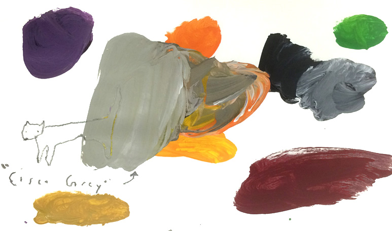
3 “Cisco’s Grey”
Titanium White
Carbon Black
Cadmium Orange
Yellow Ochre
Dioxine Purple
Cadmium Yellow Light
Cadmium Yellow Dark
Cadmium Red
Permanent Green Middle
Cisco was my cat. He died about 20 years ago but his color remains with me. This color is a warm, warm gray. It has the cozy warmth of a winter fire. It feels comforting like a hand knitted sweater.
When you make this color, it starts out super cold because you just use titanium white and carbon black to get to a medium value grey. Then you add in the other colors. It is totally visual of course. All these colors are in there but in small amounts. There is a lot of orange, however, in this grey and that is what makes it so lovely.
There is barely a place in my paintings that can’t be improved by the inclusion of this particular grey.
I hope you might find one or two of these as useful as I do.
What is your favorite color? How do you make it?
Please post below if you have a minute and tell us…super fun.
In gratitude, Nicholas

Hi! I’m
Nicholas Wilton
the founder of Art2Life.
With over 20 years experience as a working artist and educator, I’ve developed a systematic approach that brings authenticity, spontaneity and joy back into the creative process.
Join me and artists from all over the world in our Free Art2Life Artists Facebook Group or learn more here about Art2Life.

